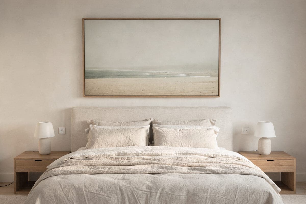
guide
Bedroom wall art: choosing pieces you can sleep under
The bedroom rewards calm — which styles lower the energy, where art goes relative to the bed, and the sizing that anchors it.
Sep 14, 2026 · 2 min read
guide
Placed Team · Sep 10, 2026 · 2 min read
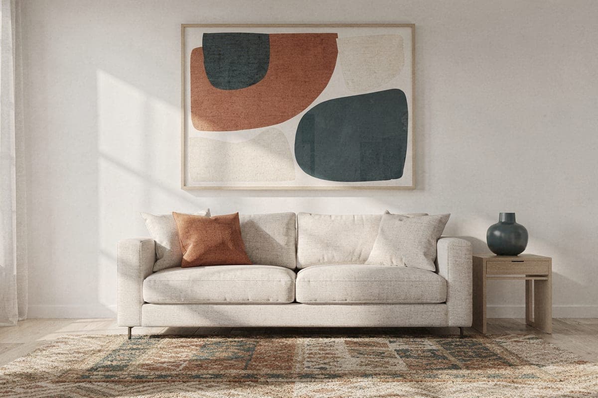
The two ways art goes wrong with color: it matches everything and disappears into the room, or it matches nothing and fights it. The art that looks intentional almost always does the same thing — it repeats one or two colors the room already has, and introduces one it doesn't.
Rooms lean warm (oak, brass, beige, terracotta) or cool (grey, black metal, white walls, blue textiles). Art doesn't have to share the room's temperature — but if it crosses it, it should do so on purpose and boldly. A cool blue landscape in a warm wood-toned room works because the contrast is clearly deliberate; a slightly-cool grey abstract in the same room just looks off.
When in doubt, match the temperature and vary the intensity.
Most people misremember their room's colors. Photograph the room and look at the photo: the dominant tones that show up on a screen are what the art actually has to live with.
This is literally how Placed works — it reads the dominant colors, lighting, and style from a photo of your room, then generates artwork that echoes your palette while introducing something new, in nine different styles. You see each option on your actual wall before deciding: try it with your room.
Color is half the equation — size is the other half. See what size art belongs above a sofa before you commit.
guide
The bedroom rewards calm — which styles lower the energy, where art goes relative to the bed, and the sizing that anchors it.
Sep 14, 2026 · 2 min read
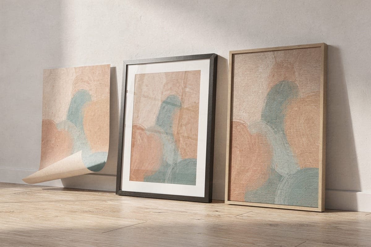
guide
The honest differences between the three main print formats — look, feel, weight, price — and which rooms each one suits.
Sep 10, 2026 · 2 min read
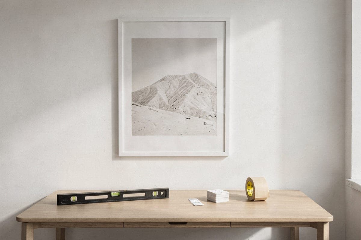
guide
Adhesive strips, hooks, rails, and leaning — what holds which weight, what your deposit survives, and where each method breaks down.
Sep 14, 2026 · 2 min read